Skip to primary navigation Skip to content Skip to footer
Back to Blog

Capital SUP Brand 3.0 – A New Era

Capital SUP rebrand 2020

Memorial Day Weekend was the start of Capital SUPs 7th year in business. It’s been quite a ride so far, but we’ve only just begun! This article is an overview of the evolution of the Capital SUP brand.

1.0

Back in 2014, we didn’t know much of anything, especially how to make a logo. Thankfully, Brian’s Uncle Lee Bonner volunteered to help. Interesting fact, Lee & Denise Bonner, who live on Spa Creek, were the first people Brian pitched Capital SUP as an idea for a business. They were the first ones to inspire us to go for it! Thanks, Denise & Lee! 

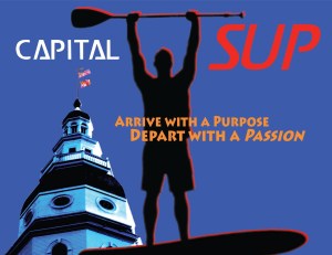
The name Capital came from living in and starting a business in Annapolis, the Capital of Maryland. SUP is short for stand up paddleboarding. Shoutout to Kevin for coming up with the name! Both are not clever, but as long as you believe in the story, it doesn’t matter. Fun fact, the other name we were considering was SUP Innovation. Brian’s idea. The business wouldn’t have lasted a year with that name.


While we don’t incorporate “Arrive With A Purpose, Depart With A Passion” in the logo anymore, the phrase is still the core of Capital SUP’s brand and culture. We put the old logo to good use, here’s an example of Chris leading a LED Night Tour in Ego Alley we dubbed “Party on the Paddleboards.”

2.0

Capital SUP 1.0 served us well in the early years as we learned how to run a business and create an identity. In 2016, we knew we had something special, so it was time to create a more identifiable brand. Enter Capital SUP 2.0. We didn’t have a specific idea in mind going into the rebrand, which is why we chose to work with 99Designs.

We couldn’t have been happier how the logo turned out. The two primary identifiers are the three stars and the paddle design in the logo. The three stars stand for the Founding partners, Brian Meyer, Kevin Haigis, and Christopher “Goose” Norman. We go by the PaddleBros! The paddle design in the circular logo was clever and had two meanings. One, the paddle design stands for paddling, the core of what we do. Second, the paddle design created the shape of a C. The C is for Capital, the first part of our name. The two red lines were an excellent addition, bringing to life the water, or that’s what we thought! We don’t remember if we asked for the colors blue and red as our brand colors. Having Capital in the name and it’s meaning to Annapolis, naturally blue and red, were the first choices. 

At first, we liked the Capital SUP lettering, but it turns out the font didn’t work for us. We’ve tried to incorporate the font in other designs outside of our company name, which didn’t work.

We have rolled with Version 2.0 for almost five years! We might classify as a small business in a small city, but our brand has a global presence in the stand-up paddleboard industry, and we’re damn proud of this! 

3.0

We had no intention of evolving the Capital SUP brand this year; however, the pandemic has made us rethink everything about the business. Both good and bad. We are very fortunate to have a company that can operate close to 100% during these unprecedented times. We genuinely feel for the millions of businesses in the world right now that are suffering. Brainstorming with the team over the past month, we found new energy and company mindset we feel strongly will allow the company to thrive this year and beyond. Over the next month, we will be announcing numerous major evolutions of Capital SUP. The first step was to give Capital SUP 2.0 logo a boost. The goal was to keep the same core logo design, but enhance the details and offer the logo more life! 

Like 2.0, we couldn’t be more thrilled about the new design! The two significant changes are the brand colors and the Capital SUP lettering. We felt a lighter shade of blue and brighter red would give the logo the personality we wanted. We are most excited about the new lettering. It’s super clean, and we were able to incorporate the paddle design into the Ps in Capital & SUP. The third significant change we wanted to accomplish was to clean up the details, which included making the lines in the logo smoother and more cohesive. For a bonus, we added a CAP SUP logo since the phrase has been coined as our company’s nickname amongst core Capital SUP paddlers.

We’re incredibly excited to share with you the next evolution of Capital SUP, the paddleboard company, and Capital SUP, the lifestyle brand. Thanks for tuning in. We’ll see you on the water soon! 

-The PaddleBros